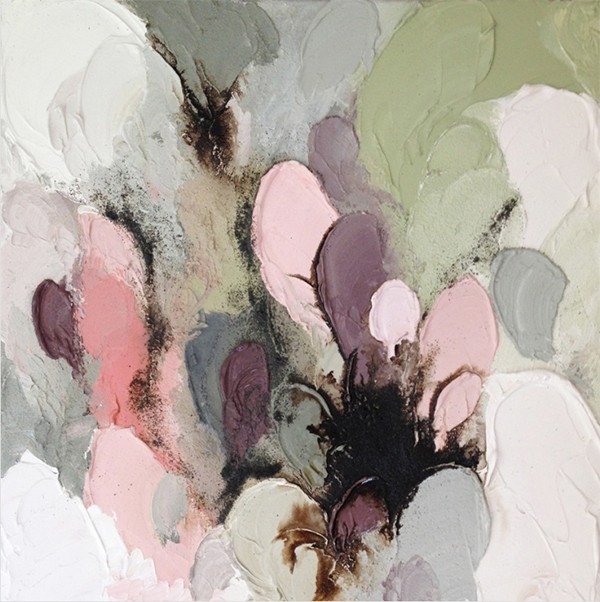
Soft pink has been on our collective radar for some time, and with Pantone announcing Rose Quartz as Colour of the Year 2016 (together with Serenity), we’re sure to be seeing a lot more of it. Dirty soft pink and blush tones are soothing and fresh, and can be used with many other colours to create beautiful colour palettes.
Palest pink combined with blush and soft neutrals is feminine but not too sweet or girlie. This soft pink works beautifully with white, pale grey and the washed-out neutral tones in wood and natural fibers.

Deeper tones of soft pink create a striking and confident palette in combination with peach, lilac and aubergine. Earthy browns, copper, with shades of green and touches of black are also great complimentary additions to this colour palette.
The image right at the top of this post, a painting by Lisa Madigan, is a lovely example of the extended palette.

What do you think of Pantone’s Colour of the Year 2016? Are you on board with Rose Quartz and pink in all its hues and tones? Dirty pink has been my colour of choice for a few years now (for my bed linen, wall hanging, and these DIY colour block pillow cases way back in 2013!), and I’m not feeling the need to move on any time soon.
Look out for some more pink palette posts in the coming weeks.