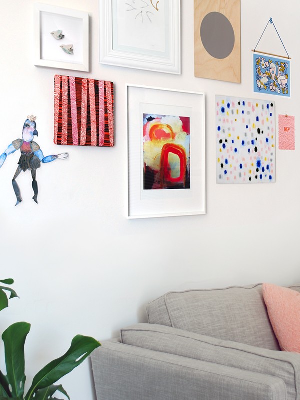
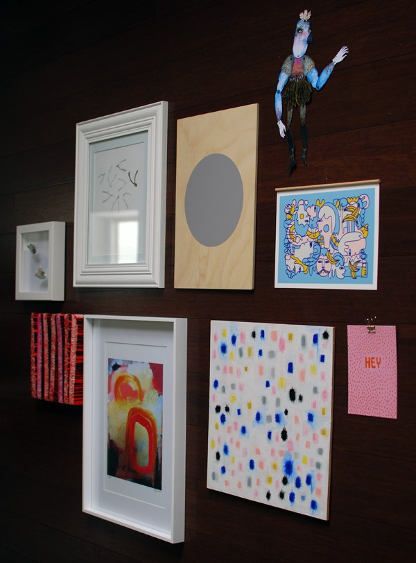
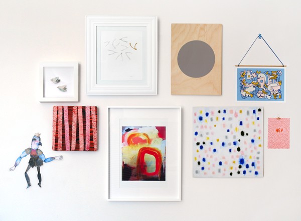
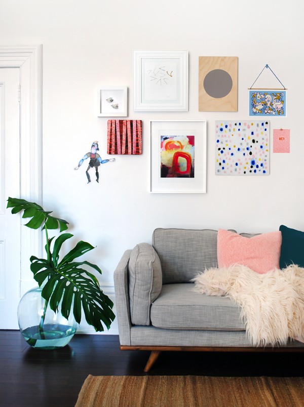
Yesterday, we revealed our curated edit of affordable Australian art on Etsy to create a unique gallery wall. (You can win one of seven artworks, valued at a total of over $1000. Better get on that now!)
In this post, I’ll walk you through the five steps to creating the perfect gallery wall for your own space.
1. Select your art
Choose works that create a sense of unity
There are many different approaches to a hanging a gallery wall (also known as a salon hang), and while there is no absolute right approach, it’s important to create a sense of unity amongst your artworks. (And by unity, we don’t mean matchy-matchy!)
For instance, you could create a thematic wall of botanical artworks; or a gallery wall dedicated to a specific medium, like pencil drawings. Or your might take a more eclectic approach, picking and choosing your favourite pieces and allowing the art to direct your arrangement, which you can re-arrange over time (as your collection grows).
I didn’t want our gallery wall to look overly-styled or predictable, so I started by looking for art that I loved and a few common colours began to emerge from my selections.
There’s a warm spectrum (red/pink/orange/yellow); cools (indigo/sky blue); and neutrals (black/grey/white). This seems like a fairly broad colour palette, but not every piece has every colour and it serves to unify all my choices.
You can see all of my art choices in detail in our affordable art post and click through to the artists’ Etsy shops from there.
Use variety and texture to add interest
I curated works in different sizes, textures and shapes to create a sense of variety and interest on the wall. From an articulated paper beast to porcelain brooches, I took an eclectic approach to my gallery wall, which reflects my overall aesethetic in my home.
Interest is also added in the various ways I’ve framed my art – or not. This was a purely personal decision, and you don’t necessarily have to collect unconventional bits and bobs to create a sense of drama on your walls. After all, that should come from the art itself.
Style your room around your art, not vice-versa
Never buy art to match your cushions. Or your sofa, for that matter. But that doesn’t mean that you can’t use pieces in your home to create a hot-diggity insta-worthy vignette (Kidding!NotKidding!).
2. Choose your frames
One of the simplest ways to unify a gallery wall of vastly different works is to stick to one colour for your frames. I chose white. It allows the art to shine, rather than the frames. Depending on your room and art, you could also consider natural timber or dramatic black.
I chose to add variety and interest with white frames, and used a contemporary simple frame, a 3D box frame and a wide timber mold frame. Professional framing is fantastic, but it can be a very costly exercise when you’re doing a gallery hang. I used store-bought frames and cut matts to fit the artworks.
For inexpensive pieces, you can always use Blu-Tack, washi tape or a small, colourful bulldog clip as a temporary or permanent solution.
I hung one of our prints using a piece of wooden dowel and a ribbon tied around each end. An indigo-coloured ribbon picked up the colours in my collection and I taped the dowel to the back of the print with washi tape. The piece was then secured to the wall with a small piece of washi tape.
Using wooden dowel is a great temporary solution to hang a piece of art, especially if your budget doesn’t stretch to a frame, and it also adds visual interest to the group.
3. Plan your layout
Work it out on the floor first
When you’ve selected the art you’d like to hang, lay out the individual pieces on the floor. You can look at the arrangement as a whole and easily move works around until you’re happy with final positions.
As I’ve mentioned before, there are many different ways to arrange a salon hang, depending on your individual space. Here, I’ll take you through the steps I took to create my gallery wall.
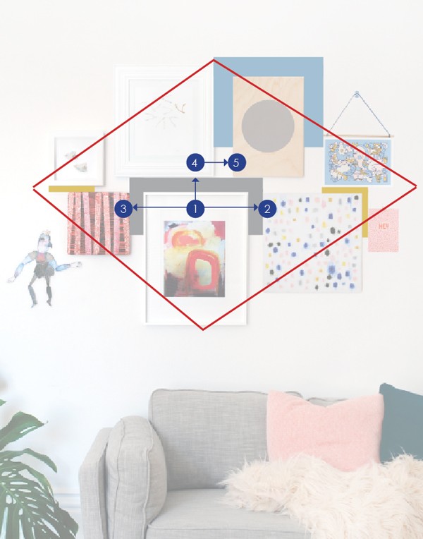
- Start with the biggest or boldest piece as a focal point. In my case, Sarah Donnell’s print (no.1). has brightest colours, the largest frame, and the painted red circle draws your eye.
- Next, arrange other pieces either side of your focal point, aligning them along the top edge (no.2, MeWe painting and no.3, Liz Payne embroidered canvas). As you arrange each artwork, consider the size and shape of each piece, as well as the colours and shapes within the art.
- Now start a second line above the first. Align pieces along their bottom edges, with the largest piece towards the centre, but not centred (no.4, Hollie Kelley illustration). Whenever in doubt, off-centre is best.
- Move the art around so the colours and shapes are balanced. Position smaller works (Erin’s Window framed brooches, Evie Barrow print and Margin greeting card) to the sides of the larger central pieces to form an overall diamond shape, as we’ve shown in the image above.
Create a balanced arrangement
Balance is all-important in a gallery wall – the overall effect should be of a harmonious whole, regardless of what individual pieces make it up.
In my selection, the Sarah Donnell abstract art print and the Flatrock screen print both feature strong circles. These strong geometric shapes draw your eye, so they balance each other out. The graphic circle on the Flatrock art is so strong that the group wouldn’t work without the abstract print to offset it. Because they are both equally dominant, these two pieces wouldn’t work in the same line because they’d visually compete.
I created balance in our hang by choosing three mostly-neutral pieces: the porcelain brooches; pencil illustration; and circle screen print, and I positioned them on the wall to create visual ‘eye rests’. With all-bright, all-bold pieces there would be too much going on. My aim was to create a hang that fed thematically (and visually) into MeWe’s ethereal original painting.
I also used the bold colours in the embroidered piece, Evie Barrow’s print and the greeting card to balance each other on either end of the grouping.
Finally I added the Ben Conservato articulated creature to mirror the colours in both the painting and Evie Barrow’s print, and to act as an unframed, free-form element to soften all the squared-off edges.
Allow the works to breathe
It’s important that you allow each work to stand on its own by creating a sense of balance, both visually and and physically.
In the diagram above, I’ve coloured in the different sections to demonstrate how each work is spaced. You’ll notice that I used three uniform spaces throughout the gallery. The only one that is different is to the right of the porcelain birds, which I opened slightly to create more space in the ‘yellow’ zone.
- The grey zone demonstrates the equal spacing around all three sides of art no.1.
- The blue zone demonstrates how I created a large space on both sides of piece no.5.
- The yellow area delineates the secondary baseline for the top row. The smaller pieces sit closer in so they remain part of the overall group and create a sense of cohesiveness.
Balance a large work and let it breathe by hanging two smaller works next to it.
You can also create a sense of space around your works by the way you frame them: matt boards are a clever way to enhance a small artwork.
4. Mock up your arrangement on the wall
When you’re happy with the layout of your artworks on the floor, take a photo of the arrangement on your phone for reference.
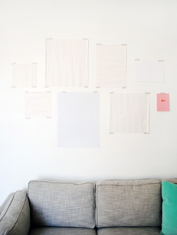
Next, place each piece of art on top of a large sheet of paper. Trace around them and cut out the shapes. If your frames come with a piece of paper in them, you can use them as your mock-up pieces instead.
Start with the largest, central piece in the bottom row, and work out from there. Stick the bottom row first, then the top row. Use Washi tape or Blu-Tack to attach the pieces of paper to the wall.
It doesn’t need to be 100 per cent accurate and measured to the last millimetre. My hang is certainly not exact and I refined the placement as I went along, so I could judge how the the colours and shapes worked together on the white wall.
If you’re hanging your art above a sofa, the bottom of the frame should be no closer than 30cm above the top of the sofa.
Step back, look and adjust.
5. Hang your art
When you’re happy with the arrangement, start with the same central piece of art, then hang each piece of art in the order illustrated in the layout diagram. Leave the paper templates on the wall until after you’ve hung the art.
Remember that the space between the top and bottom rows is the same as the space between the large pieces. By varying the spacing of the smaller art on each end of the group, I created more intimate sub-groupings.
Step back, admire your handiwork and take a look at the styling of the area. A touch of greenery is the perfect way to create a sense of drama, and to balance your salon hang.
Two large stems of monstera in my huge vintage glass demijohn adds height to break up the strong horizontals created by the top of the sofa and the gallery wall. Those rounded soft shapes also help to offset the geographic effect of the framed art.
So there you go – how to create the perfect gallery wall in five steps.
Don’t forget to enter in our amazing giveaway with Etsy to win 7 of the pieces of art in my gallery wall, valued at over $1000. Go!
Photography and styling by Lisa Tilse for We Are Scout.
Disclosure: All links to Etsy are affiliate links, however this does not impact our editorial decisions. All inclusions in We Are Scout are based on their individual merit and ability to make us smile (exploding confetti cannons optional).
