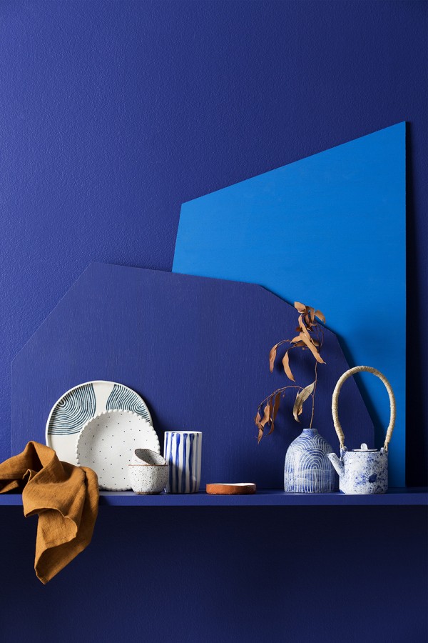
Last week I attended the launch of Volume 1 of the Haymes Colour Library – an innovative new colour trends model. With our constant connectivity and online visual overload, it makes sense that we see and adopt trends faster. It follows then that the traditional model of seasonal colour trends could be viewed as outdated. Enter The Colour Library.
The Colour Library contains seven volumes of colour themes, each with its own story and palette of colours. Volume 1, ‘Curate’, was launched in partnership with Etsy and it heralds a new direction in the thinking around releasing colour stories and themes.
Wendy Rennie, Colour & Concept Manager at Haymes Paint explains this shift in strategy for Haymes and what it will mean for the future. “The landscape has dramatically changed in the past few years, particularly with how quickly people can access global trend information via social media and digital platforms.”
“We are seeing a more fluid environment when it comes to colours and trends, which makes it difficult to embargo or hold off releasing new information. The Colour Library allows us to move away from putting a date on colour and helps us build an evolving palette that can be changed according to personal style and taste,” said Wendy.
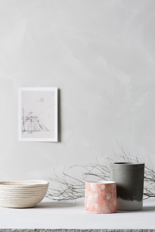
The Colour Library Volume 1: Curate
According to Haymes, ‘Curate’ represents a considerable shift for colour directions in 2016. It incorporates unexpected colour combinations and is influenced by natural materials such a leather, rope, linen and ceramics. To illustrate the ‘Curate’ palette of electric blues, bright coral, rich tan and soft greys, Haymes collaborated with Etsy to showcase the handcrafted wares of eleven Australian makers. Wendy Rennie explains it was a natural fit “Sharing a commitment to authenticity, creativity and local design provided a strong platform for this partnership to flourish.”
Click through to Haymes Loves Etsy to see the profiles of all the talented makers involved in the ‘Curate’ collaboration.
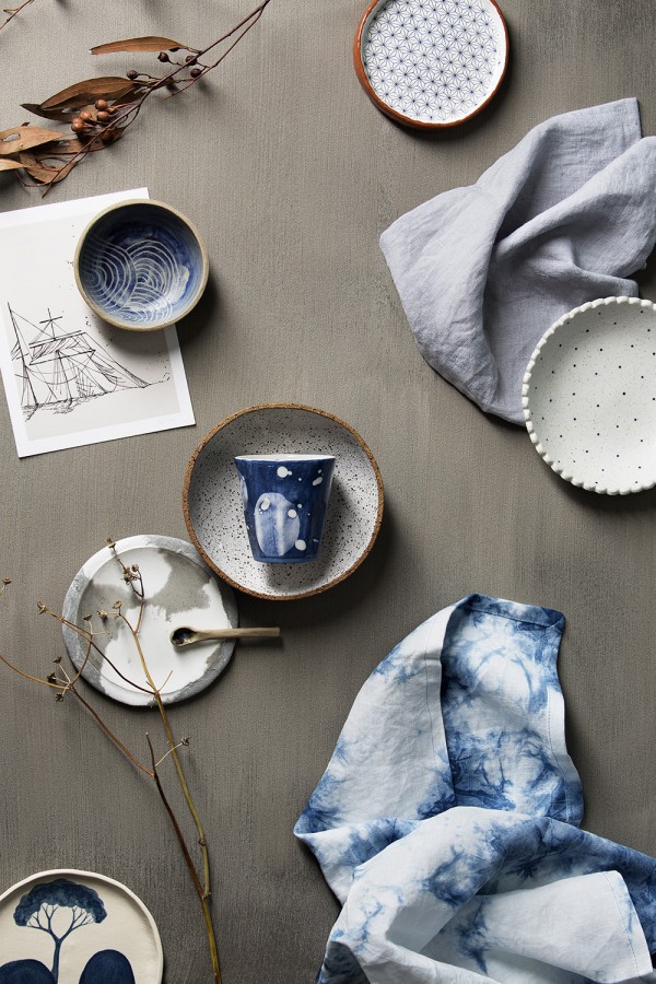
The Colour Library Volumes 2 – 7
Although only Volume 1 was officially launched, here is a little taster of Volumes 2 – 7 of The Colour Library.
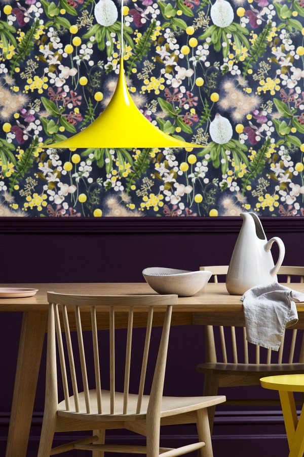
The Colour Library Volume 2: Collaborate
A rich palette of lush greens, deep red wines and golden yellows are where interiors and natural beauty connect with an unmistakable botanical feel. Melbourne patterns designer Louise Jones brings the ‘Collaborate’ palette to life in her botanical paintings transformed into bespoke wallpaper.
The Colour Library Volume 3: Consider
The ‘Consider’ palette is about creating interiors with a fresh organic feel. Soft pastel blues, greens and yellows are paired with earthy neutrals.
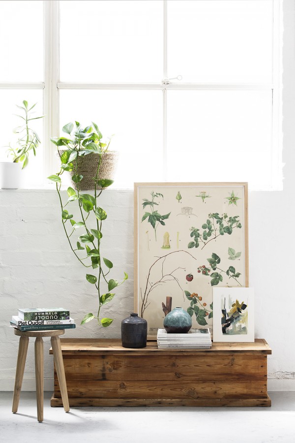
The Colour Library Volume 4: Conscious
‘Conscious’ is all about the physical and mental effect of colour. It’s all about creating intimate spaces that are soft and airy to encourage relaxation and unwinding. Dusty pinks and blues sit alongside warm grey tones.
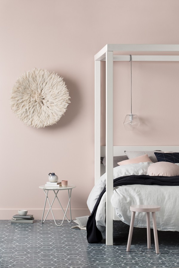
The Colour Library Volume 5: Experience
The ‘Experience’ colour palette is bright and vibrant. It’s about the energy to do more, see more, and know more. The colours are bright cherry red, purple and yellow, softened by pastels and fresh neutrals.
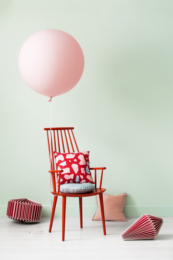
The Colour Library Volume 6: Form
‘Form’ is about defining spaces with bold colour – colours that are definitive and strong in contrast. Think blue, teal and mustard, with deep muddy tones and light neutrals.
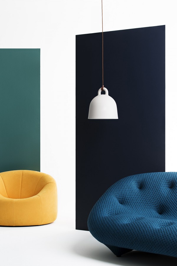
The Colour Library Volume 7: Timeless
This palette tells us to look back in order to look forward. It encompasses colours of eras gone by and brings them up to date. Colours include Wedgewood blue, burnt reds and terracotta, and clay neutrals.
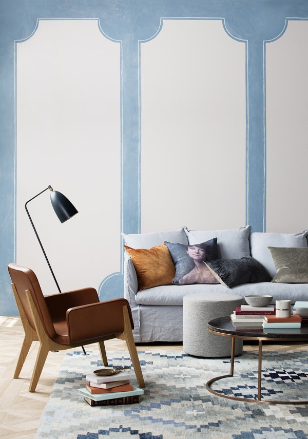
All photos courtesy of Haymes. Photography by Matina Gemmola, styling by Ruth Welsby.
The volumes of The Colour Library allow us to move away from putting a date on colour. We gain an understanding of current directions, while being able to adopt what suits us and our lifestyle through educated choices. What do you think of this new forecasting method?